
Good day to all Amasty blog readers!
Today we're speaking on a topic that's often missed by shops: making your 404 stand out.
What we can do with 404 error pages
The bigger your shop is, the more important the issue of 404 page appears to be.
For e-commerce sites, 404 page plays a huge role: it should hook different customer groups not to let them go away from the wrong page. Thus, there are many options you could use for your 404 page:
- search box;
- popular/bestselling items;
- a coupon code or special offers;
- the right piece of text explaining what happened;
- category list;
- featured/last posts/items;
- key links;
- or any combination of these elements.
However, there's another side of the story: as always, you have to stand out of the crowd. Beyond the techy and marketing tasks this pages solve, you could use it for bigger ideas:
- branding
- link building (people eagerly link to great/humorous/entertaining content)
- getting more of social media traffic
- connecting positive shopping experience with your brand (remember that most of the customers don't enjoy shopping at all?)
404 error pages are still ignored by shops
Doing research for the article, I looked through hundreds of top Alexa sites on Shopping, choosing the funniest or the most beautiful or creative 404 error page examples. And that's what I've found:
- lots and lots of shops use the default 404 page - which isn't a deadly sin, but is definitely an opportunity to do a little bit more here;
- lots of shops redirect from non-existent pages to category/previous/home pages, which is also okay, but still may be rather confusing, especially for inexperienced Internet users. It's good to show a small notification that the page a visitor requested does not exist and he was redirected.
- lots of shops do not have a proper 404 page at all. In this case you see an empty page, or a page showing a standard 404 error message returned by the server, no design, no links whatsoever. I would estimate the number of shops without a proper (at least default) CMS 404 page around 40%, which is a surprisingly big amount for the top Alexa list!
- other small issues like showing the 404 error text in a wrong language.
- creative, funny or at least remarkable 404 pages are not more than 3% - in fact, I spend much more time I though it might need me to compose a decent list of 404 page examples.
Finally: best 404 error page examples for 2014 in e-commerce
But still I was lucky to meet interesting, amusing, funny and beautiful 404 error pages from e-commerce sites; they're worth a mention and a couple of your minutes. Who knows, maybe you'll find inspiration from this list.
If you need to have a look at the details of the screenshots, just click to enlarge the pictures.
1. underarmour.com
Nothing complicated - but the powerful image and coloring make this 404 page stand out.

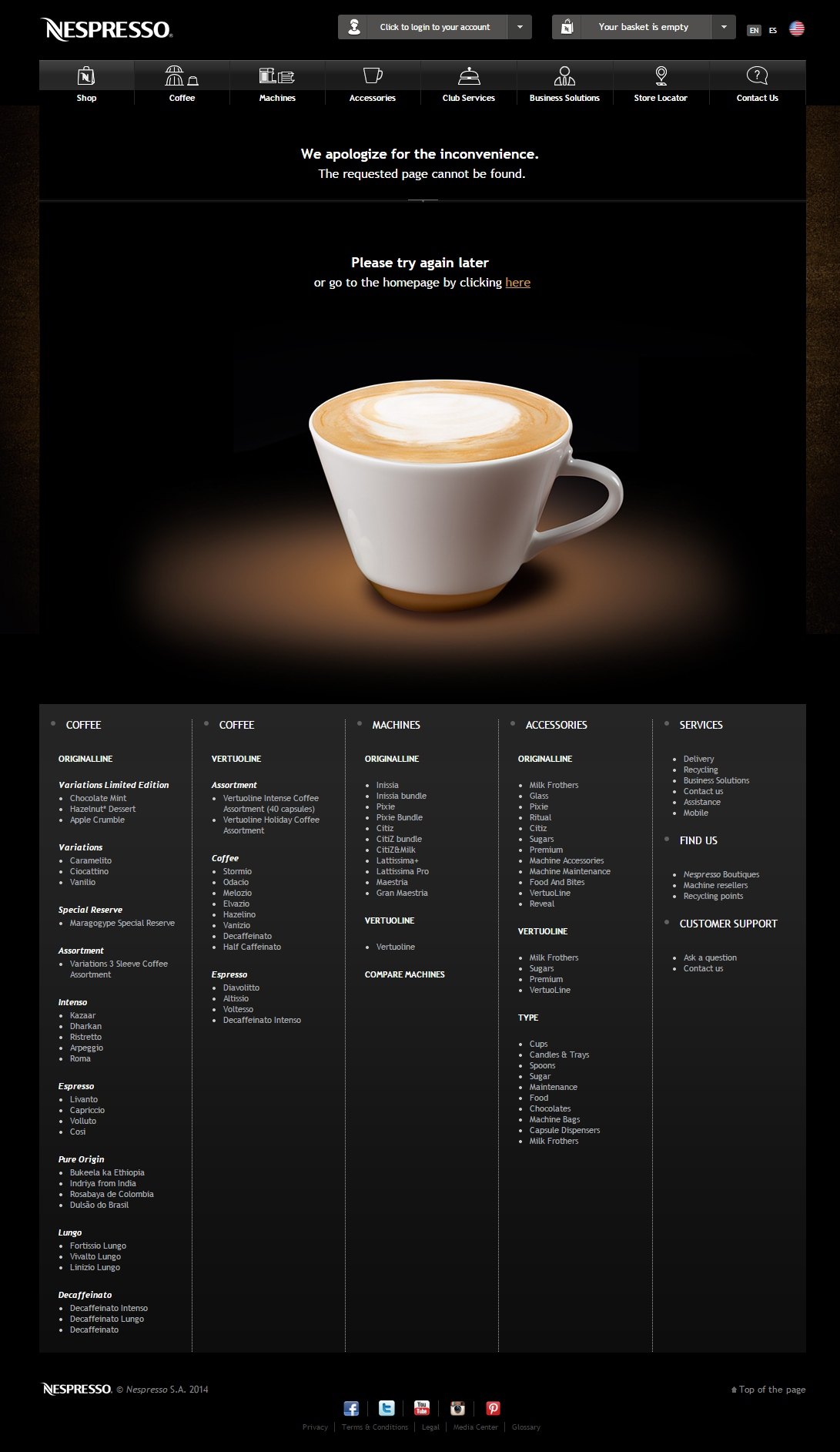
2. nespresso.com
Brand everything! Just one powerful image with a perfect cup of coffee turns unpleasant experience of visiting a deleted or moved page into something better.
3. futureshop.ca
A nice example: Future Shop made a 404 page which really adds to the website's design and uses a nice idea of the gadget showing the custom 404 error text.

4. modcloth.com
A dog in pants and a funny call to action; good mood guaranteed.

5. lego.com
A perfect 404 page branding example from Lego:

6. backcountry.com
This is one of my fav 404 e-commerce pages; here we can see a full sized powerful picture strongly connected with the brand.

7. bedbathandbeyond.com
Nice example of combining great wording and a custom picture. A very bright and emotional 404 error page.

8. ikea.com
A very simple but keen page!

9. etsy.com
Things happen, says 404 page for Etsy.

10. munchkin.com
Somebody looks very upset because of the page missing.

11. shop.lululemon.com
At first sight this page looks rather ordinary: a header, some text and a stock image. But if you take a closer look...

12. dish.com
Another nice example of using a photo of high contrast and powerful colors.

13. mlb.mlb.com
This 404 error page shows random oof-y GIFs. Some folks might even need will power not to get stuck.

14. bluenile.com
A simple and elegant 404 page example; also it's a very mild call to action, as from our nature we don't like empty boxes and tend to fill them.

15. karmaloop.com
Even a man without pants can be okay if it suits your audience.

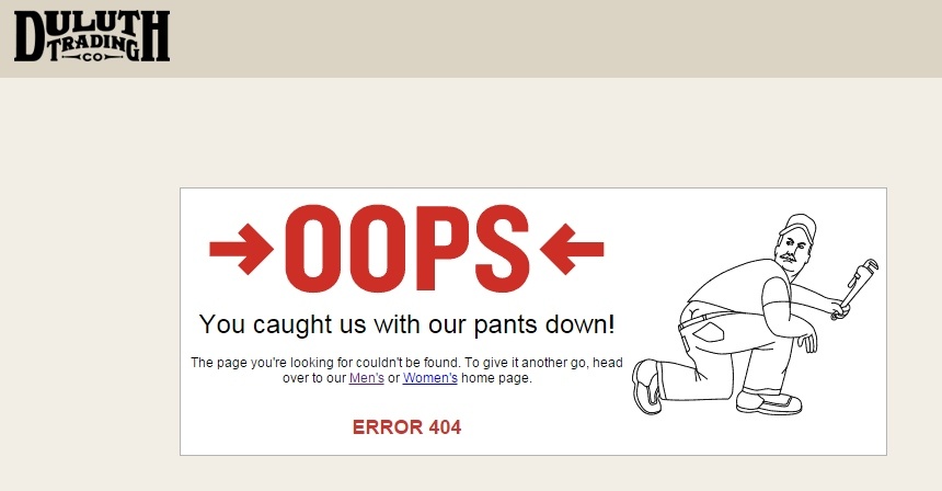
16. duluthtrading.com
Well... Don't know who was the first to catch up with the idea.
17. otterbox.com
Another nice idea from Otterbox: unicorns and creative wording. 'If you are feeling optimistic' is definitely a hit.

18. converse.com
An excellent example of a minimalistic 404 error page: black and white, no pics, just color and a couple of words plus a link to the main page.

19. opticsplanet.com
And again a decent example of using products you actually sell on the 404 page.

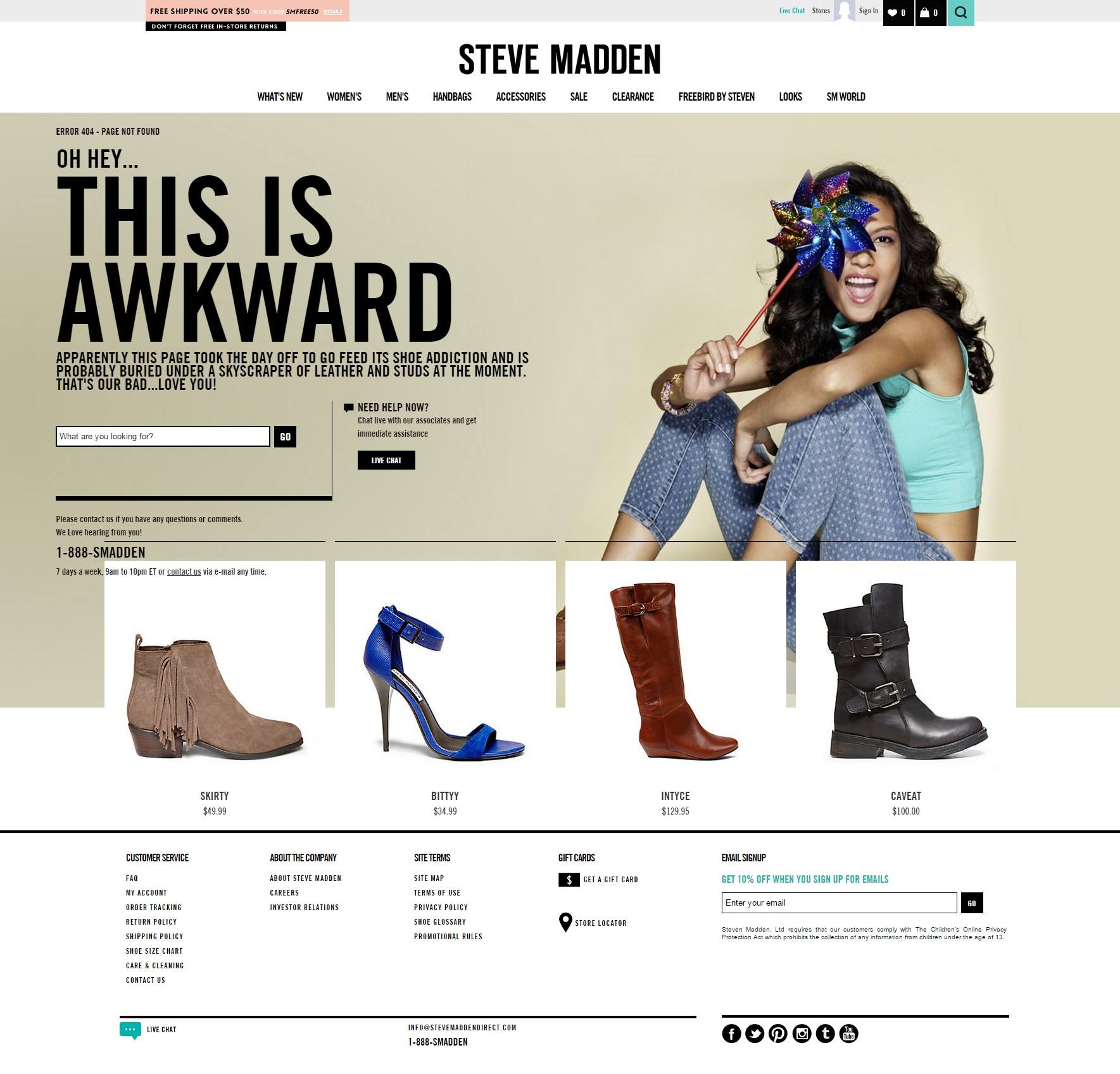
20. stevemadden.com
Here's a lovely design that suits the overall website layout perfectly and uses its powerful sides: wise typography and soulful pics.
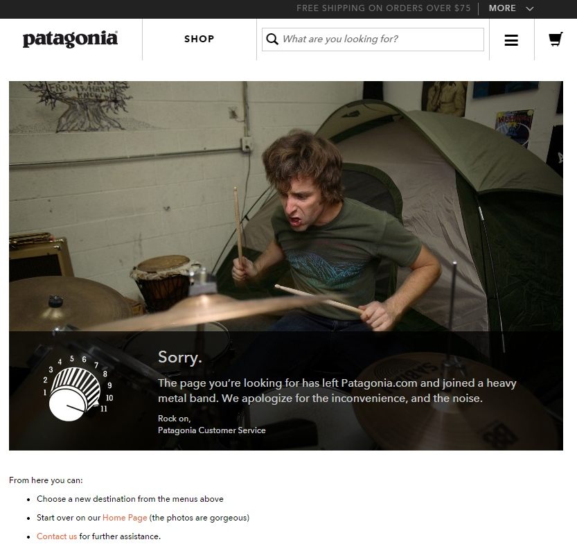
21. patagonia.com
Thumbs up for a page that joined a heavy metal band.
Conclusion
So, what makes an outstanding 404 page if we look at these examples? (Excluding the standard blocks like search, links and so on)
- branding: using your brand, products or services pics or mentions;
- powerful pictures that catch the eye; use high contrast or rich color and try to combine it with your website's design;
- wise wording: a tweak or two will do;
- humor, jokes and funny things that your audience will love.
Did you like some particular ones? Or can you share other 404 page examples you've recently met?